
Intro
Performance Testing Essentials highlighted the value of test result review and presentation with simple, straightforward metrics including percentiles. Perhaps as a refresher, percentiles provide dataset distribution rather than, for example, an average which normally reveals little since the system’s behavior is numerically-reduced enough to “wash out” valuable detail.
This post briefly reviews percentiles but, more importantly, covers cumulative distribution plots as a finer-grained and visual extension of percentiles.
Illustrative Scenario and Metric Data
Assume a performance test with 12,000 HTTP round trip timings (“RTTs”). Also assume the requests and infrastructure were highly uniform and involatile so we should expect results with minimal variance, right? But, upon review our range is 100 milliseconds to 1 second–seemingly wide given the uniformity, so what could finer-resolution review reveal quickly and meaningfully?
We could plot the entire dataset as a simple chart: Individual request timestamps on x, corresponding round trip time on y.
While that’s likely quick and useful for other inquiries, here we’re focusing on distribution, which that plot would not readily depict, and thus it’s not very useful.
So let’s start with “percentiles”.
Percentiles
Percentiles are likely familiar to anyone who’s reviewed performance data output, or even completely-unrelated data, given their value and ubiquity. They correlate measurement thresholds with percentages thus presenting distribution and, regardless of by what means a dataset’s percentiles were calculated, resemble this using our RTT data:
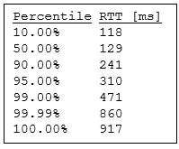
Now we know that higher response times are the exception—for example, 1% took approximately 500ms or longer. We can compare these values to KPI objectives (e.g., “99% max 500ms” or “100% sub-second”), but let’s visualize all values with cumulative distribution where, in effect, every round trip time corresponds to distribution relative to all other samples (hence the term cumulative).
Cumulative Distribution
Cumulative distribution is visualized–there is no “table” like the prior section’s percentile bins (unless we’re willing to wrestle a table as large as the dataset itself and only after various calculations—certainly neither practical nor helpful). The following is an R-generated cumulative distribution plot from our dataset (download script and sample data at the end):
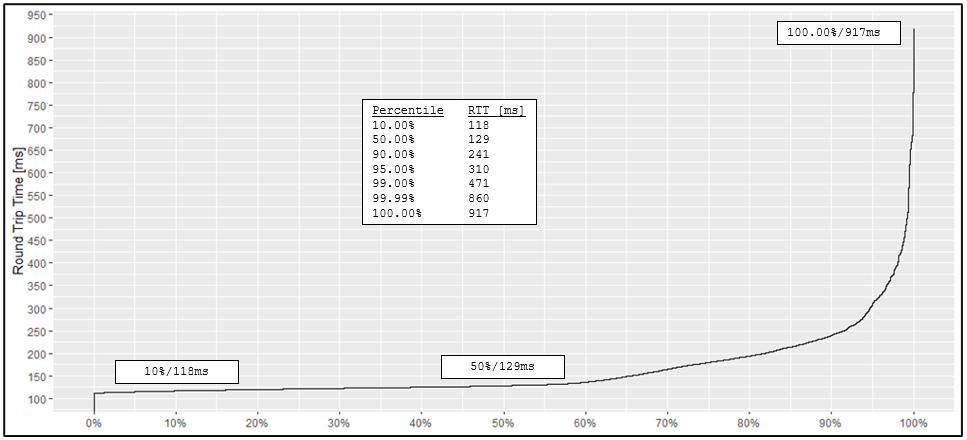
Hopefully the plot is mostly self-explanatory: each of our 12,000 values is plotted and correlates to its cumulative percentage. In effect this “flattens” distribution while still correlating to the percentile bins.
Distribution may be represented by other plot types, such as distinct round trip time (x) vs. number of requests (y) depicted below from the same data:
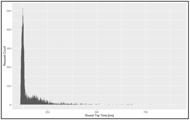
Granted, such a basic plot is not entirely without value, but since it expresses requests as absolute (number of requests for each distinct timing) and not relative (percentage) values, we’re left with, at best, a coarse distribution inference–a much less precise and simple representation than a cumulative plot. Plus, we’ve lost our direct correlation with the percentile table.
Stay Tuned for “Tail Latency”
In addition to its simplicity, intuitiveness, and direct percentile correlation, cumulative distribution plots are especially relevant to tail latency (the right-most area of the above plot beginning around 90% is commonly referred to as “the tail”).
Searching “tail latency” reveals volumes but, and to maintain this post’s focus, will be reserved for later. In the meantime, consider factors that impact performance–positively and negatively–and how the “the tail” might render differently including what it may suggest about performance, especially when compared across tests.
FYI
Spreadsheets
Neither Excel nor the various Open Offices provide native cumulative distribution plotting and thus require a manual and somewhat clunky process. It follows they’re not ideal integration candidates, whether for within this post’s context or others, especially when numerous other solutions, R or not, are better automation fits.
However, spreadsheets are not completely without purpose when analyzing data, not everyone is versed in R or has other plotting means at their disposal, so the sample code linked at the end includes a PDF on how to create a spreadsheet-based cumulative distribution plot.
Observability and Log Ingestion Solutions
As of this writing, several well-known observability and log ingestion and visualization tools do not seem to offer cumulative distribution plotting natively. Perhaps they do and it was overlooked or referred to by a different name, but ultimately this post is about visualizing distribution regardless of what is used. Regardless, most such tools provide integration and, if all else fails, data extract capabilities.
Final Thoughts & Sample Code
Final Thoughts
The type of performance test and observed metrics notwithstanding, distribution is paramount: It reflects reality whereas averages by themselves simply cannot, and is easily-calculated with percentiles that in turn are easily-extended, visualized, and automated with cumulative distribution.
Sample Code
Sample R script, data, and cumulative distribution spreadsheet “how-to” PDF:
Download (cdf-sample-material-17dec2021.zip).